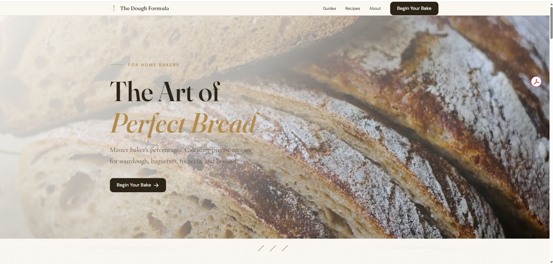
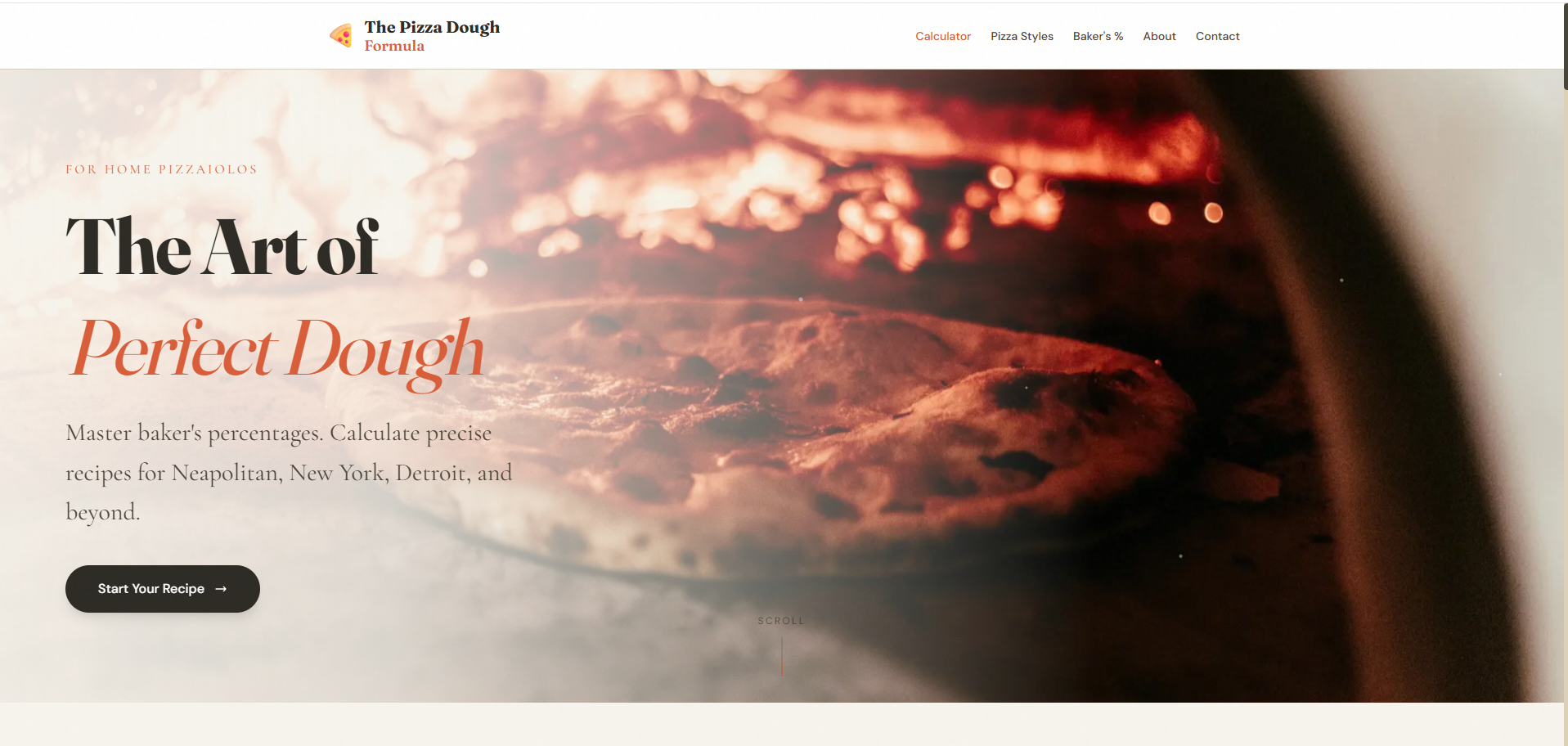
Two calculator sites that use baker’s percentages to help home bakers and home pizza makers build precise recipes. The Dough Formula covers sourdough, baguettes, focaccia, ciabatta, brioche, sandwich loaf, and no-knead. The Pizza Dough Formula covers Neapolitan, New York, Detroit, thin-and-crispy, poolish/biga, and emergency same-day dough.
The two sites share a design system (component library, interaction model, progressive disclosure pattern) and intentionally diverge on visual identity and tone. The audiences are different communities even when the underlying products are nearly identical.
Pizza dough is bread dough. The math is baker’s percentages either way, the calculator interaction is the same, and from a pure engineering view, two sites is overhead.
From a design view, two sites is the only honest answer. I’m an active member of both communities, and the audiences don’t overlap as much as the product similarity would suggest. Bread bakers come from a forum-and-technique culture that values slow craft. Pizza makers come from a more visual, equipment-focused community where the pursuit is often gear and style as much as dough. The same content, the same calculator, branded the same way, would have read as “made for someone else” to whichever audience wasn’t represented in the visual identity.
That decision drove the rest.
Built two sites because the audiences belong to different communities.
The bread audience and the pizza audience overlap less than the products do. I’ve spent time on both sets of forums and Facebook groups, and the conversations have different vocabulary, different reference points, different posture. A single site with a “bread or pizza” toggle would have been faster to build and would have served neither audience as well as a dedicated home does.
Each site is also a future home for its own newsletter and community. Those layers are much easier to grow when the brands are already separate.
Shared the interaction model and design system across both.
What’s the same across both sites: the underlying calculator architecture, the recipe output structure, the progressive-disclosure pattern from preset to custom to advanced, the “Plan My Bake” timeline feature, the educational sections on baker’s percentages, the FAQ pattern. Both sites use the same Astro components and the same conceptual model.
That shared backbone matters because every improvement to one site can be ported to the other within a day. When I added a new advanced-options tab on the bread site, the pizza site got the same pattern soon after. The design system isn’t a document, it’s the code shared between the two products.
Intentionally differentiated visual identity and tone.
The Dough Formula reads polished and upscale. Cream background, refined typography, calmer palette, more long-form text. It’s designed to look like a serious resource for someone learning a craft.
The Pizza Dough Formula carries a different posture. Warmer accent colors, faster-paced layout, entry points designed for “pizza tonight” energy (including an Emergency same-day dough preset and a 2-hour countdown timer). Same calculator backbone, different scene.
Both feel polished. Each is polished for its own audience.
Designed progressive disclosure so beginners aren't intimidated and experts can dial in.
The most distinctive UI choice across both sites is the preset-to-advanced progression. A new baker or pizza maker lands on the page, picks a style preset (Sourdough, Neapolitan, etc.), and gets a working recipe immediately, with no exposure to the dozen variables under the hood. An advanced user opens the Advanced Options panel and gets tabs for Basics, Yeast, Flour, Enrichments, Temperature, Timing, and Preferments, covering every variable they’d want to dial in.
This pattern is what lets the same calculator serve both audiences without compromising for either. Beginners aren’t shown complexity they aren’t ready for. Experts aren’t condescended to with oversimplified controls.
Optimized for users who never outgrow the tool.
Most calculator sites optimize for one user: beginners with presets only, or experts with everything exposed. Both make the tool disposable. The beginner-only version is something you stop using once you know what you’re doing. The expert-only version is something you don’t start with.
The design decision from day one was to serve both with the same tool. A user lands as a beginner with a sourdough preset, and three years later is still on the same page running custom recipes with a 25% poolish and adjusted hydration for whole-grain. The page is where they started and where they stay.
That’s a different success metric than “convert to subscription.” It’s “be the tool they keep open in a tab on bake day.”
The biggest open question is how to grow the two communities without breaking the design system. Newsletters, comment threads, recipe sharing, and user-submitted formulas are all on the roadmap, and each one has to be designed twice (shared infrastructure, distinct expression). The next phase of the design system will be testing how much community machinery can stay shared and how much has to be branded uniquely.