Cottages Concierge is a B2B SaaS for short-term rental hosts. It’s an AI concierge that answers guest questions from the property’s own content (WiFi password, check-in instructions, local recommendations) and forwards anything it doesn’t know to the host. It serves a specific slice of the STR market: hosts who own one or two properties and run them personally, not vacation rental management companies.
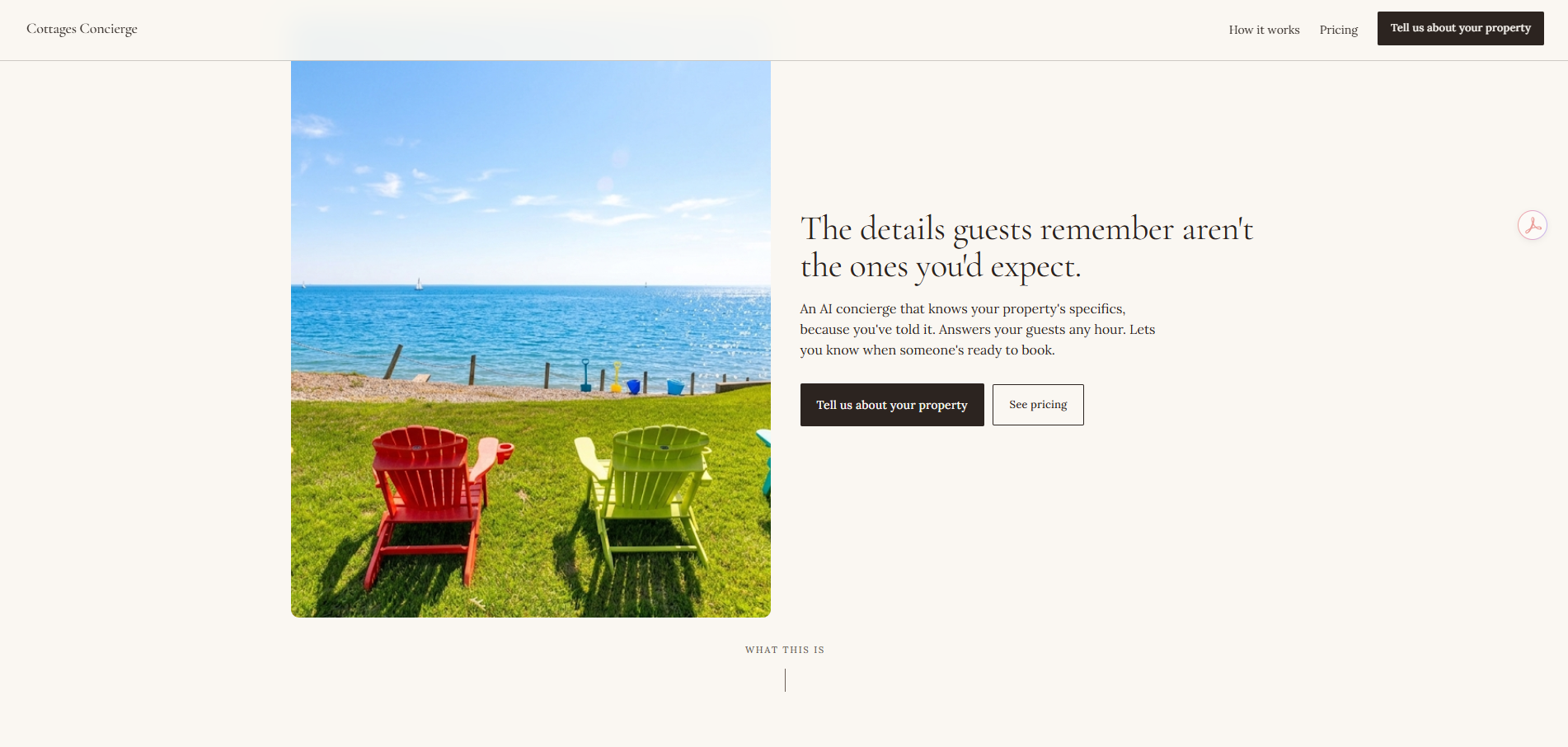
The product is currently in development. The initial test property is Pearl Beach Cottages, my family’s two Lake Erie rentals.
The design challenge wasn’t the product, it was the audience. Most SaaS in this space is either built for enterprise property managers (feature-dense, sales-led) or built for tech-forward indie hosts (dashboard-first, very B2B SaaS in voice). Neither fits the audience I was designing for: people who happen to own a rental, who care about their guests by name, and who would rather have a tool that feels like a neighbor than a vendor.
The marketing site, the voice, the pricing, all of those had to read as “this is for me” to someone who runs their property like a small business. That meant making decisions that look unusual against typical B2B SaaS patterns.
Designed the marketing site for normal people who happen to own an STR.
The audience isn’t a property manager evaluating a tool. It’s a couple who owns a lakeside cottage they rent out a dozen times a year, who don’t want a CRM, who don’t want to “scale a portfolio.” The voice across the site avoids SaaS vocabulary (no “leverage,” no “optimize,” no “platform”) and uses plain language about real situations: the 11pm text asking for the WiFi, the forwarded check-in email the guest can’t find, the same five questions answered every turnover.
That positioning narrows the addressable market. It also makes the site readable to the people I actually want to reach.
Showed the product through a conversation, not screenshots.
Most SaaS marketing sites pile UI screenshots into the page to demonstrate the product. For this product, screenshots would have been the wrong call. The thing the product does is have a conversation. A screenshot of a chat UI is not a conversation, it’s a chat UI. I designed a clean conversational mockup with a real-feeling exchange between a guest and the concierge (door code, breakfast recommendation, broken hot tub) that demonstrates the product’s behavior rather than its interface.
It also keeps the visual flow of the site clean. Screenshots tend to bring chrome, browser frames, and color noise that pull against editorial layout.
Led with what the AI can't do, not what it can.
“Answers what it knows. Forwards what it doesn’t.” That’s an unusual headline for an AI product. Most marketing claims more capability, not less.
Two reasons for going the other direction. First, the audience is a host who’s afraid of losing control of their property, of an AI representing them badly, of a hallucinated answer given to a paying guest. Leading with limitations addresses that fear before it forms. Second, the broader AI moment in 2026 is one of skepticism. Customers know AI hallucinates, and a product that pretends it doesn’t reads as either naive or dishonest. Honesty about constraints is the credibility move.
Made pricing transparent because the audience isn't being sold to, they're being invited in.
Two tiers, real prices, no “contact us for pricing.” The decision came from how I thought about the audience: people who happen to own an STR, evaluating a small tool, on their own time. Hiding pricing turns a curious evaluation into a sales process, and that breaks the whole positioning. Transparent pricing is consistent with the voice: this is a thing you can buy for your rental, not something you have to negotiate for.
Used Pearl Beach as the design partner from day one.
The product was built for and tested against my family’s two Lake Erie rentals before any thinking went into selling it elsewhere. That changed what got designed and what didn’t. The real questions guests ask repeat: parking, WiFi, checkout time, where to eat. Designing against those specific questions rather than imagined edge cases kept the concierge focused. Using it on our own properties also surfaced things I wouldn’t have anticipated from a desk, like the importance of a QR placard at the property as the discovery surface. Most guests find the concierge by scanning, not by clicking a link in an email.
The biggest open design question is matching the voice of the marketing site to the voice of the concierge product itself. The marketing site speaks to the host. The concierge speaks to the guest. Those are different audiences, and the tone of the second has to fit each property’s character without forcing the host into a tone-configuration step that feels like work.
The product is in active development, with launch timed to mid-summer through the fall 2026 rental season.